Blog
2023-02-03
Imagine a set of 142 points on a two-dimensional graph.
The mean of the \(x\)-values of the points is 54.26.
The mean of the \(y\)-values of the points is 47.83.
The standard deviation of the \(x\)-values is 16.76.
The standard deviation of the \(y\)-values is 26.93.
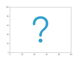
What are you imagining that the data looks like?
Whatever you're thinking of, it's probably not this:
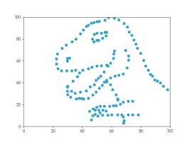
This is the datasaurus, a dataset that was created by Alberto Cairo in
2016 to remind people to look beyond the summary statistics when analysing a dataset.
Anscombe's quartet
In 1972, four datasets with a similar aim were publised. Graphs in statistical analysis by Francis J Anscombe [1] contained four datasets that have become known as Anscombe's quartet: they all have the same
mean \(x\)-value, mean \(y\)-value, standard deviation of \(x\)-values, standard deviation of \(y\)-values, linear regression line, as well multiple other values
related to correlation and variance. But if you plot them, the four datasets look very different:
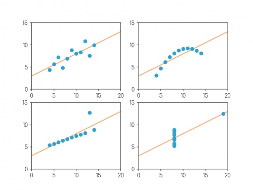
Plots of the four datasets that make up Anscombe's quartet. For each set of data:
the mean of the \(x\)-values is 9; the mean of the \(y\)-values is 7.5;
the standard deviation of the \(x\)-values is 3.32; the standard deviation of the \(y\)-values is 2.03;
the correlation coefficient between \(x\) and \(y\) is 0.816;
the linear regression line is \(y=3+0.5x\);
and coefficient of determination of linear regression is 0.667.
Anscombe noted that there were prevalent attitudes that:
- "Numerical calculations are exact, but graphs are rough."
- "For any particular kind of statistical data, there is just one set of calculations constituting a correct statistical analysis."
- "Performing intricate calculations is virtuous, actually looking at the data is cheating."
The four datasets were designed to counter these by showing that data exhibiting the same statistics can actually be very very different.
The datasaurus dozen
Anscombe's datasets indicate their point well, but the arrangement of the points is very regular and looks a little artificial when compared with real data sets.
In 2017, twelve sets of more realistic-looking data were published (in Same stats, different graphs: generating datasets with varied appearance and identical statistics through simulated annealing by Justin Matejka and George Fitzmaurice [2]).
These datasets—known as the datasaurus dozen—all had the same
mean \(x\)-value, mean \(y\)-value,
standard deviation of \(x\)-values, standard deviation of \(y\)-values, and corellation coefficient (to two decimal places) as the datasaurus.
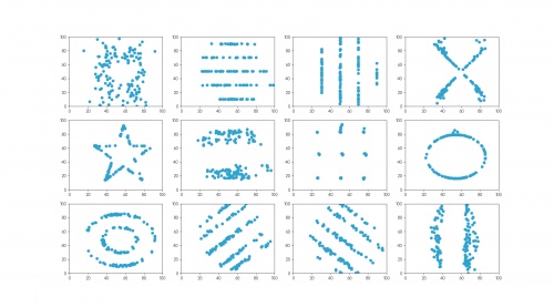
The twelve datasets that make up the datasaurus dozen. For each set of data (to two decimal places):
the mean of the \(x\)-values is 54.26; the mean of the \(y\)-values is 47.83;
the standard deviation of the \(x\)-values is 16.76; the standard deviation of the \(y\)-values is 26.93;
the correlation coefficient between \(x\) and \(y\) is -0.06.
Creating datasets like this is not trivial: if you have a set of values for the statistical properties of a dataset, it is difficult to create a dataset with those properties—especially
one that looks like a certain shape or pattern.
But if you already have one dataset with the desired properties, you can make other datasets with the same properties by very slightly moving every point in a random direction then
checking that the properties are the same—if you do this a few times, you'll eventually get a second dataset with the right properties.
The datasets in the datasaurus dozen were generated using this method: repeatedly adjusting all the points ever so slightly, checking if the properties were the same, then
keeping the updated data if it's closer to a target shape.
The databet
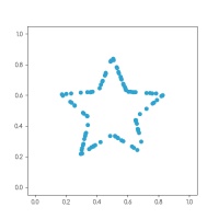
Using the same method, I generated the databet: a collection of datasets that look like the letters of the alphabet. I started with this set
of 100 points resembling a star:
After a long time repeatedly moving points by a very small amount, my computer eventually generated these 26 datasets, all of which have the same means,
standard deviations, and correlation coefficient:
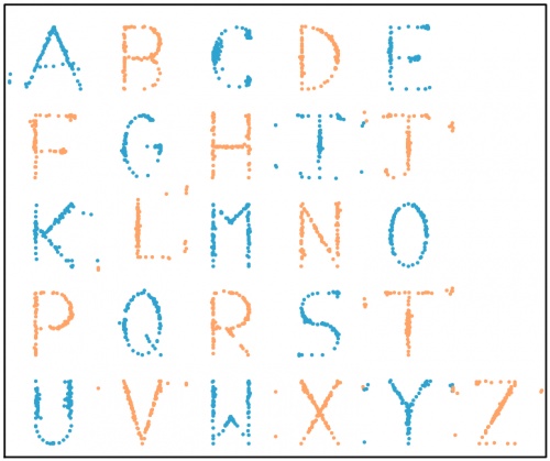
The databet. For each set of data (to two decimal places):
the mean of the \(x\)-values is 0.50; the mean of the \(y\)-values is 0.52;
the standard deviation of the \(x\)-values is 0.17; the standard deviation of the \(y\)-values is 0.18;
the correlation coefficient between \(x\) and \(y\) is 0.16.
Words
Now that we have the alphabet, we can write words using the databet. You can enter a word or phrase here to do this:
Given two data sets with the same number of points, we can make a new larger dataset by including all the points in both the smaller sets.
It is possible to write the mean and standard deviation of the larger dataset in terms of the means and standard deviations of the smaller sets: in each case,
the statistic of the larger set depends only on the statistics of the smaller sets and not on the actual data.
Applying this to the databet, we see that the datasets that spell words of a fixed length will all have the same mean and standard deviation.
(The same is not true, sadly, for the correlation coefficient.) For example, the datasets shown in the following plot both have the same means and standard deviations:
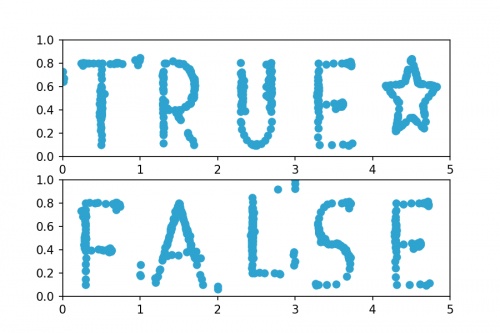
Datasets that spell "TRUE☆" and "FALSE". For both sets of (to two decimal places):
the mean of the \(x\)-values is 2.50; the mean of the \(y\)-values is 0.52;
the standard deviation of the \(x\)-values is 1.42; the standard deviation of the \(y\)-values is 0.18.
Hopefully by now you agree with me that Anscombe was right: it's very important to plot data as well as looking at the summary statistics.
If you want to play with the databet yourself, all the letters are available on GitHub in JSON format.
The GitHub repo also includes fonts that you can download and install so you can use Databet Sans in
your next important document.
References
[1] Graphs in statistical analysis by Francis J Anscombe. American Statistician, 1973.
[2] Same stats, different graphs: generating datasets with varied appearance and identical statistics through simulated annealing by Justin Matejka and George Fitzmaurice. Proceedings of the 2017 CHI Conference on Human Factors in Computing Systems, 2017.
(Click on one of these icons to react to this blog post)
You might also enjoy...
Comments
Comments in green were written by me. Comments in blue were not written by me.
⭐ top comment (2023-02-03) ⭐
Very cool! Thanks for sharing ????Jessica
Add a Comment
2018-06-16
This year, like every World Cup year, I've been collecting stickers to fill the official Panini World Cup sticker album.
Back in March, I calculated that I should expect it to cost £268.99 to fill this year's album (if I order the last 50 stickers).
As of 6pm yesterday, I need 47 stickers to complete the album (and have placed an order on the Panini website for these).
So... How much did it cost?
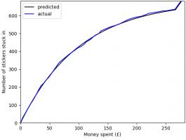
In total, I have bought 1781 stickers (including the 47 I ordered) at a cost of £275.93. The plot below shows
the money spent against the number of stickers stuck in, compared with the what I predicted in March.
To create this plot, I've been keeping track of exactly which stickers were in each pack I bought. Using this data, we can
look for a few more things. If you want to play with the data yourself, there's a link at the bottom to download it.
Swaps
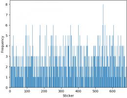
The bar chart below shows the number of copies of each sticker I got (excluding the 47 that I ordered). Unsurprisingly, it looks a lot like
random noise.
The sticker I got most copies of was sticker 545, showing Panana player Armando Cooper.
I got swaps of 513 different stickers, meaning I'm only 169 stickers short of filling a second album.
First pack of all swaps
Everyone who has every done a sticker book will remember the awful feeling you get when you first get a pack of all swaps.
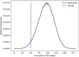
For me, the first time this happened was the 50th pack. The plot below shows when the first pack of all swaps occurred in 500,000 simulations.
Looks like I was really quite unlucky to get a pack of all swaps so soon.
Duplicates in a pack
In all the 345 packs that I bought, there wasn't a single pack that contained two copies of the same sticker.
In fact, I don't remember ever getting two of the same sticker in a pack. For a while I've been wondering if this is because Panini
ensure that packs don't contain duplicates, or if it's simply very unlikely that they do.
If it was down to unlikeliness, the probability of having no duplicates in one pack would be:
\begin{align}
\mathbb{P}(\text{no duplicates in a pack}) &= 1 \times\frac{681}{682}\times\frac{680}{682}\times\frac{679}{682}\times\frac{678}{682}\\
&= 0.985
\end{align}
and the probability of none of my 345 containing a duplicate would be:
\begin{align}
\mathbb{P}(\text{no duplicates in 345 packs})
&= 0.985^{345}\\
&= 0.00628
\end{align}
This is very very small, so it's safe to conclude that Panini do indeed ensure that packs do not contain duplicates.
The data
If you'd like to have a play with the data yourself, you can download it here. Let me know if
you do anything with it...
(Click on one of these icons to react to this blog post)
You might also enjoy...
Comments
Comments in green were written by me. Comments in blue were not written by me.
Add a Comment
2017-11-14
A few weeks ago, I took the copy of MENACE that I built to Manchester Science Festival, where it played around 300 games against the public while learning to play Noughts and Crosses. The group of us operating MENACE for the weekend included Matt Parker, who made two videos about it. Special thanks go to Matt, plus
Katie Steckles,
Alison Clarke,
Andrew Taylor,
Ashley Frankland,
David Williams,
Paul Taylor,
Sam Headleand,
Trent Burton, and
Zoe Griffiths for helping to operate MENACE for the weekend.
As my original post about MENACE explains in more detail, MENACE is a machine built from 304 matchboxes that learns to play Noughts and Crosses. Each box displays a possible position that the machine can face and contains coloured beads that correspond to the moves it could make. At the end of each game, beads are added or removed depending on the outcome to teach MENACE to play better.
Saturday
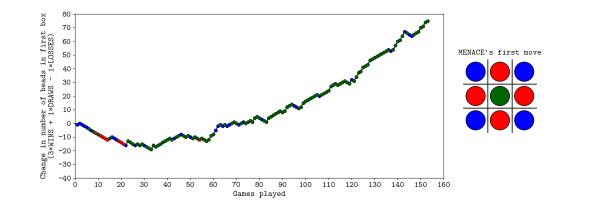
On Saturday, MENACE was set up with 8 beads of each colour in the first move box; 3 of each colour in the second move boxes; 2 of each colour in third move boxes; and 1 of each colour in the fourth move boxes. I had only included one copy of moves that are the same due to symmetry.
The plot below shows the number of beads in MENACE's first box as the day progressed.
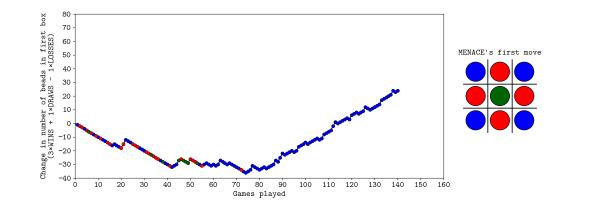
Originally, we were planning to let MENACE learn over the course of both days, but it learned more quickly than we had expected on Saturday, so we reset is on Sunday, but set it up slightly differently. On Sunday, MENACE was set up with 4 beads of each colour in the first move box; 3 of each colour in the second move boxes; 2 of each colour in third move boxes; and 1 of each colour in the fourth move boxes. This time, we left all the beads in the boxes and didn't remove any due to symmetry.
The plot below shows the number of beads in MENACE's first box as the day progressed.
You can download the full set of data that we collected over the weekend here. This includes the first two moves and outcomes of all the games over the two days, plus the number of beads in each box at the end of each day. If you do something interesting (or non-interesting) with the data, let me know!
(Click on one of these icons to react to this blog post)
You might also enjoy...
Comments
Comments in green were written by me. Comments in blue were not written by me.
WRT the comment 2017-11-17, and exactly one year later, I had the same thing happen whilst running MENACE in a 'Resign' loop for a few hours, unattended. When I returned, the orange overlay had appeared, making the screen quite difficult to read on an iPad.
g0mrb
On the JavaScript version, MENACE2 (a second version of MENACE which learns in the same way, to play against the original) keeps setting the 6th move as NaN, meaning it cannot function. Is there a fix for this?
Lambert
what would happen if you loaded the boxes slightly differently. if you started with one bead corresponding to each move in each box. if the bead caused the machine to lose you remove only that bead. if the game draws you leave the bead in play if the bead causes a win you put an extra bead in each of the boxes that led to the win. if the box becomes empty you remove the bead that lead to that result from the box before
Ian
Hi, I was playing with MENACE, and after a while the page redrew with a Dragon Curves design over the top. MENACE was still working alright but it was difficult to see what I was doing due to the overlay. I did a screen capture of it if you want to see it.
Russ
Add a Comment

