Blog
2023-02-03
Imagine a set of 142 points on a two-dimensional graph.
The mean of the \(x\)-values of the points is 54.26.
The mean of the \(y\)-values of the points is 47.83.
The standard deviation of the \(x\)-values is 16.76.
The standard deviation of the \(y\)-values is 26.93.
What are you imagining that the data looks like?
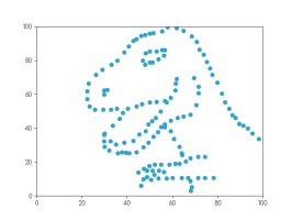
Whatever you're thinking of, it's probably not this:
This is the datasaurus, a dataset that was created by Alberto Cairo in
2016 to remind people to look beyond the summary statistics when analysing a dataset.
Anscombe's quartet
In 1972, four datasets with a similar aim were publised. Graphs in statistical analysis by Francis J Anscombe [1] contained four datasets that have become known as Anscombe's quartet: they all have the same
mean \(x\)-value, mean \(y\)-value, standard deviation of \(x\)-values, standard deviation of \(y\)-values, linear regression line, as well multiple other values
related to correlation and variance. But if you plot them, the four datasets look very different:
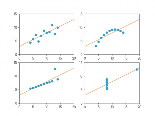
Plots of the four datasets that make up Anscombe's quartet. For each set of data:
the mean of the \(x\)-values is 9; the mean of the \(y\)-values is 7.5;
the standard deviation of the \(x\)-values is 3.32; the standard deviation of the \(y\)-values is 2.03;
the correlation coefficient between \(x\) and \(y\) is 0.816;
the linear regression line is \(y=3+0.5x\);
and coefficient of determination of linear regression is 0.667.
Anscombe noted that there were prevalent attitudes that:
- "Numerical calculations are exact, but graphs are rough."
- "For any particular kind of statistical data, there is just one set of calculations constituting a correct statistical analysis."
- "Performing intricate calculations is virtuous, actually looking at the data is cheating."
The four datasets were designed to counter these by showing that data exhibiting the same statistics can actually be very very different.
The datasaurus dozen
Anscombe's datasets indicate their point well, but the arrangement of the points is very regular and looks a little artificial when compared with real data sets.
In 2017, twelve sets of more realistic-looking data were published (in Same stats, different graphs: generating datasets with varied appearance and identical statistics through simulated annealing by Justin Matejka and George Fitzmaurice [2]).
These datasets—known as the datasaurus dozen—all had the same
mean \(x\)-value, mean \(y\)-value,
standard deviation of \(x\)-values, standard deviation of \(y\)-values, and corellation coefficient (to two decimal places) as the datasaurus.
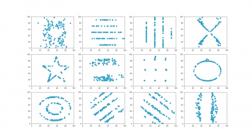
The twelve datasets that make up the datasaurus dozen. For each set of data (to two decimal places):
the mean of the \(x\)-values is 54.26; the mean of the \(y\)-values is 47.83;
the standard deviation of the \(x\)-values is 16.76; the standard deviation of the \(y\)-values is 26.93;
the correlation coefficient between \(x\) and \(y\) is -0.06.
Creating datasets like this is not trivial: if you have a set of values for the statistical properties of a dataset, it is difficult to create a dataset with those properties—especially
one that looks like a certain shape or pattern.
But if you already have one dataset with the desired properties, you can make other datasets with the same properties by very slightly moving every point in a random direction then
checking that the properties are the same—if you do this a few times, you'll eventually get a second dataset with the right properties.
The datasets in the datasaurus dozen were generated using this method: repeatedly adjusting all the points ever so slightly, checking if the properties were the same, then
keeping the updated data if it's closer to a target shape.
The databet
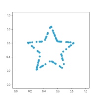
Using the same method, I generated the databet: a collection of datasets that look like the letters of the alphabet. I started with this set
of 100 points resembling a star:
After a long time repeatedly moving points by a very small amount, my computer eventually generated these 26 datasets, all of which have the same means,
standard deviations, and correlation coefficient:
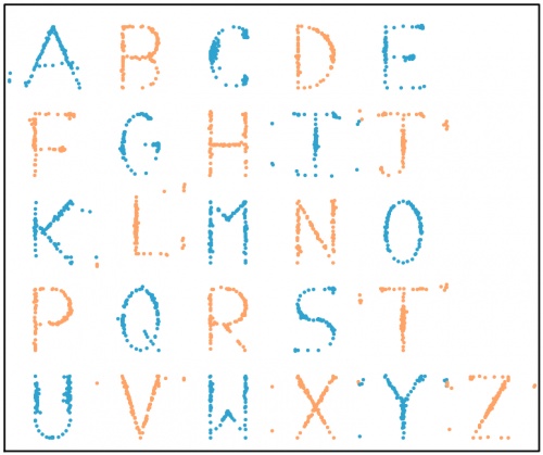
The databet. For each set of data (to two decimal places):
the mean of the \(x\)-values is 0.50; the mean of the \(y\)-values is 0.52;
the standard deviation of the \(x\)-values is 0.17; the standard deviation of the \(y\)-values is 0.18;
the correlation coefficient between \(x\) and \(y\) is 0.16.
Words
Now that we have the alphabet, we can write words using the databet. You can enter a word or phrase here to do this:
Given two data sets with the same number of points, we can make a new larger dataset by including all the points in both the smaller sets.
It is possible to write the mean and standard deviation of the larger dataset in terms of the means and standard deviations of the smaller sets: in each case,
the statistic of the larger set depends only on the statistics of the smaller sets and not on the actual data.
Applying this to the databet, we see that the datasets that spell words of a fixed length will all have the same mean and standard deviation.
(The same is not true, sadly, for the correlation coefficient.) For example, the datasets shown in the following plot both have the same means and standard deviations:
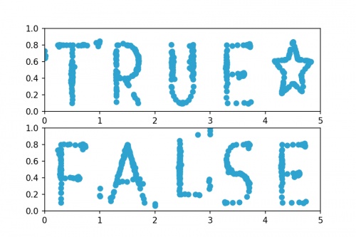
Datasets that spell "TRUE☆" and "FALSE". For both sets of (to two decimal places):
the mean of the \(x\)-values is 2.50; the mean of the \(y\)-values is 0.52;
the standard deviation of the \(x\)-values is 1.42; the standard deviation of the \(y\)-values is 0.18.
Hopefully by now you agree with me that Anscombe was right: it's very important to plot data as well as looking at the summary statistics.
If you want to play with the databet yourself, all the letters are available on GitHub in JSON format.
The GitHub repo also includes fonts that you can download and install so you can use Databet Sans in
your next important document.
References
[1] Graphs in statistical analysis by Francis J Anscombe. American Statistician, 1973.
[2] Same stats, different graphs: generating datasets with varied appearance and identical statistics through simulated annealing by Justin Matejka and George Fitzmaurice. Proceedings of the 2017 CHI Conference on Human Factors in Computing Systems, 2017.
(Click on one of these icons to react to this blog post)
You might also enjoy...
Comments
Comments in green were written by me. Comments in blue were not written by me.
⭐ top comment (2023-02-03) ⭐
Very cool! Thanks for sharing ????Jessica
Add a Comment
2020-03-31
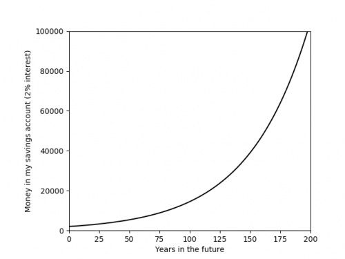
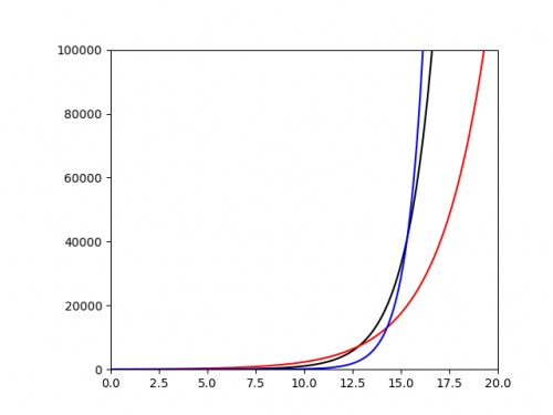
Recently, you've probably seen a lot of graphs that look like this:
The graph above shows something that is growing exponentially: its equation is \(y=kr^x\), for some constants \(k\) and \(r\).
The value of the constant \(r\) is very important, as it tells you how quickly the value is going to grow. Using a graph of some data,
it is difficult to get an anywhere-near-accurate approximation of \(r\).
The following plot shows three different exponentials. It's very difficult to say anything about them except that they grow very quickly above around \(x=15\).
It would be nice if we could plot these in a way that their important properties—such as the value of the ratio \(r\)—were more clearly evident from the
graph. To do this, we start by taking the log of both sides of the equation:
$$\log y=\log(kr^x)$$
Using the laws of logs, this simplifies to:
$$\log y=\log k+x\log r$$
This is now the equation of a straight line, \(\hat{y}=m\hat{x}+c\), with \(\hat{y}=\log y\), \(\hat{x}=x\), \(m=\log r\) and \(c=\log k\). So if we plot
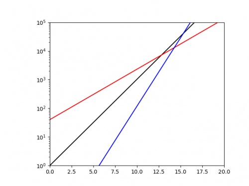
\(x\) against \(\log y\), we should get a straight line with gradient \(\log r\). If we plot the same three exponentials as above using a log-scaled \(y\)-axis, we get:
From this picture alone, it is very clear that the blue exponential has the largest value of \(r\), and we could quickly work out a decent approximation of this value
by calculating 10 (or the base of the log used if using a different log) to the power of the gradient.
Log-log plots
Exponential growth isn't the only situation where scaling the axes is beneficial. In my research in finite and boundary element methods,
it is common that the error of the solution \(e\) is given in terms of a grid parameter \(h\) by a polynomial of the form
\(e=ah^k\),
for some constants \(a\) and \(k\).
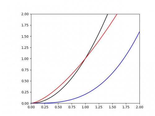
We are often interested in the value of the power \(k\). If we plot \(e\) against \(h\), it's once again difficult to judge the value of \(k\) from the graph alone. The following
graph shows three polynomials.
Once again is is difficult to judge any of the important properties of these. To improve this, we once again begin by taking the log of each side of the equation:
$$\log e=\log (ah^k)$$
Applying the laws of logs this time gives:
$$\log e=\log a+k\log h$$
This is now the equation of a straight line, \(\hat{y}=m\hat{x}+c\), with \(\hat{y}=\log e\), \(\hat{x}=\log h\), \(m=k\) and \(c=\log a\). So if we plot
\(\log x\) against \(\log y\), we should get a straight line with gradient \(k\).
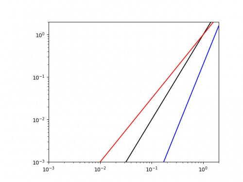
Doing this for the same three curves as above gives the following plot.
It is easy to see that the blue line has the highest value of \(k\) (as it has the highest gradient, and we could get a decent approximation of this value by finding the line's gradient.
As well as making it easier to get good approximations of important parameters, making curves into straight lines in this way also makes it easier to plot the trend of real data.
Drawing accurate exponentials and polynomials is hard at the best of times; and real data will not exactly follow the curve, so drawing an exponential or quadratic of best fit will be an
even harder task. By scaling the axes first though, this task simplifies to drawing a straight line through the data; this is much easier.
So next time you're struggling with an awkward curve, why not try turning it into a straight line first.
(Click on one of these icons to react to this blog post)
You might also enjoy...
Comments
Comments in green were written by me. Comments in blue were not written by me.
Add a Comment
2019-12-27
In tonight's Royal Institution Christmas lecture,
Hannah Fry and Matt Parker demonstrated how machine learning works using MENACE.
The copy of MENACE that appeared in the lecture was build and trained by me. During the training, I logged all the moved made by MENACE and the humans playing against them, and using this data I have
created some visualisations of the machine's learning.
First up, here's a visualisation of the likelihood of MENACE choosing different moves as they play games. The thickness of each arrow represented the number of beads in the box corresponding to that move,
so thicker arrows represent more likely moves.
The likelihood that MENACE will play each move.
There's an awful lot of arrows in this diagram, so it's clearer if we just visualise a few boxes. This animation shows how the number of beads in the first box changes over time.
You can see that MENACE learnt that they should always play in the centre first, an ends up with a large number of green beads and almost none of the other colours. The following
animations show the number of beads changing in some other boxes.
MENACE learns that the top left is a good move.
MENACE learns that the middle right is a good move.
MENACE is very likely to draw from this position so learns that almost all the possible moves are good moves.
The numbers in these change less often, as they are not used in every game: they are only used when the game reached the positions shown on the boxes.
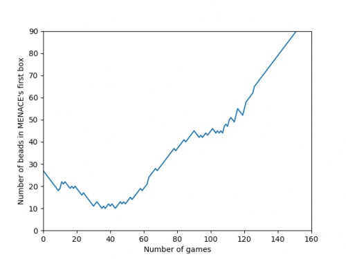
We can visualise MENACE's learning progress by plotting how the number of beads in the first box changes over time.
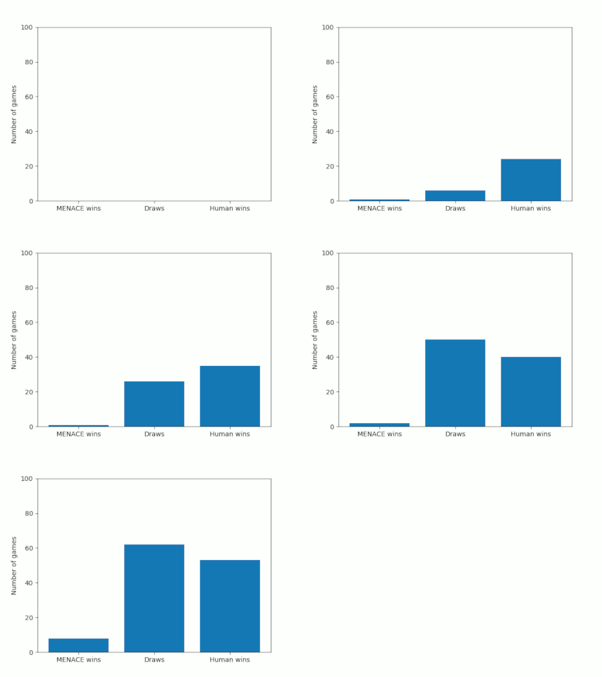
Alternatively, we could plot how the number of wins, loses and draws changes over time or view this as an animated bar chart.
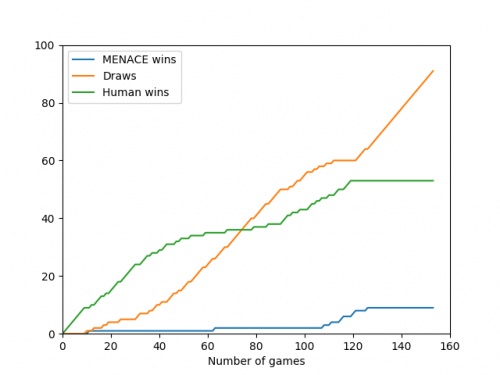
The number of games MENACE wins, loses and draws.
The number of games MENACE has won, lost and drawn.
If you have any ideas for other interesting ways to present this data, let me know in the comments below.
(Click on one of these icons to react to this blog post)
You might also enjoy...
Comments
Comments in green were written by me. Comments in blue were not written by me.
@(anonymous): Have you been refreshing the page? Every time you refresh it resets MENACE to before it has learnt anything.
It takes around 80 games for MENACE to learn against the perfect AI. So it could be you've not left it playing for long enough? (Try turning the speed up to watch MENACE get better.)
It takes around 80 games for MENACE to learn against the perfect AI. So it could be you've not left it playing for long enough? (Try turning the speed up to watch MENACE get better.)
Matthew
I have played around menace a bit and frankly it doesnt seem to be learning i occasionally play with it and it draws but againt the perfect ai you dont see as many draws, the perfect ai wins alot more
(anonymous)
@Colin: You can set MENACE playing against MENACE2 (MENACE that plays second) on the interactive MENACE. MENACE2's starting numbers of beads and incentives may need some tweaking to give it a chance though; I've been meaning to look into this in more detail at some point...
Matthew
Idle pondering (and something you may have covered elsewhere): what's the evolution as MENACE plays against itself? (Assuming MENACE can play both sides.)
Colin
Add a Comment
2018-06-16
This year, like every World Cup year, I've been collecting stickers to fill the official Panini World Cup sticker album.
Back in March, I calculated that I should expect it to cost £268.99 to fill this year's album (if I order the last 50 stickers).
As of 6pm yesterday, I need 47 stickers to complete the album (and have placed an order on the Panini website for these).
So... How much did it cost?
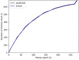
In total, I have bought 1781 stickers (including the 47 I ordered) at a cost of £275.93. The plot below shows
the money spent against the number of stickers stuck in, compared with the what I predicted in March.
To create this plot, I've been keeping track of exactly which stickers were in each pack I bought. Using this data, we can
look for a few more things. If you want to play with the data yourself, there's a link at the bottom to download it.
Swaps
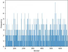
The bar chart below shows the number of copies of each sticker I got (excluding the 47 that I ordered). Unsurprisingly, it looks a lot like
random noise.
The sticker I got most copies of was sticker 545, showing Panana player Armando Cooper.
I got swaps of 513 different stickers, meaning I'm only 169 stickers short of filling a second album.
First pack of all swaps
Everyone who has every done a sticker book will remember the awful feeling you get when you first get a pack of all swaps.
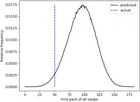
For me, the first time this happened was the 50th pack. The plot below shows when the first pack of all swaps occurred in 500,000 simulations.
Looks like I was really quite unlucky to get a pack of all swaps so soon.
Duplicates in a pack
In all the 345 packs that I bought, there wasn't a single pack that contained two copies of the same sticker.
In fact, I don't remember ever getting two of the same sticker in a pack. For a while I've been wondering if this is because Panini
ensure that packs don't contain duplicates, or if it's simply very unlikely that they do.
If it was down to unlikeliness, the probability of having no duplicates in one pack would be:
\begin{align}
\mathbb{P}(\text{no duplicates in a pack}) &= 1 \times\frac{681}{682}\times\frac{680}{682}\times\frac{679}{682}\times\frac{678}{682}\\
&= 0.985
\end{align}
and the probability of none of my 345 containing a duplicate would be:
\begin{align}
\mathbb{P}(\text{no duplicates in 345 packs})
&= 0.985^{345}\\
&= 0.00628
\end{align}
This is very very small, so it's safe to conclude that Panini do indeed ensure that packs do not contain duplicates.
The data
If you'd like to have a play with the data yourself, you can download it here. Let me know if
you do anything with it...
(Click on one of these icons to react to this blog post)
You might also enjoy...
Comments
Comments in green were written by me. Comments in blue were not written by me.
Add a Comment

