Blog
2023-02-03
Imagine a set of 142 points on a two-dimensional graph.
The mean of the \(x\)-values of the points is 54.26.
The mean of the \(y\)-values of the points is 47.83.
The standard deviation of the \(x\)-values is 16.76.
The standard deviation of the \(y\)-values is 26.93.
What are you imagining that the data looks like?
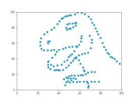
Whatever you're thinking of, it's probably not this:
This is the datasaurus, a dataset that was created by Alberto Cairo in
2016 to remind people to look beyond the summary statistics when analysing a dataset.
Anscombe's quartet
In 1972, four datasets with a similar aim were publised. Graphs in statistical analysis by Francis J Anscombe [1] contained four datasets that have become known as Anscombe's quartet: they all have the same
mean \(x\)-value, mean \(y\)-value, standard deviation of \(x\)-values, standard deviation of \(y\)-values, linear regression line, as well multiple other values
related to correlation and variance. But if you plot them, the four datasets look very different:
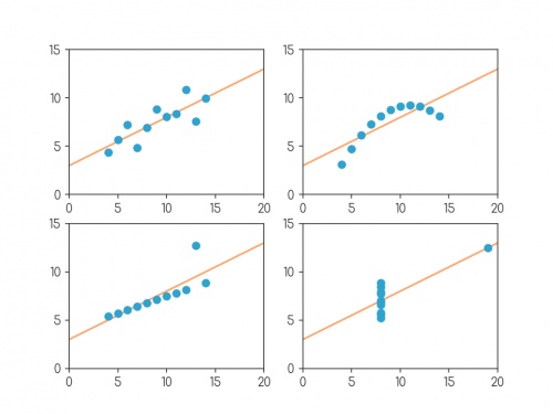
Plots of the four datasets that make up Anscombe's quartet. For each set of data:
the mean of the \(x\)-values is 9; the mean of the \(y\)-values is 7.5;
the standard deviation of the \(x\)-values is 3.32; the standard deviation of the \(y\)-values is 2.03;
the correlation coefficient between \(x\) and \(y\) is 0.816;
the linear regression line is \(y=3+0.5x\);
and coefficient of determination of linear regression is 0.667.
Anscombe noted that there were prevalent attitudes that:
- "Numerical calculations are exact, but graphs are rough."
- "For any particular kind of statistical data, there is just one set of calculations constituting a correct statistical analysis."
- "Performing intricate calculations is virtuous, actually looking at the data is cheating."
The four datasets were designed to counter these by showing that data exhibiting the same statistics can actually be very very different.
The datasaurus dozen
Anscombe's datasets indicate their point well, but the arrangement of the points is very regular and looks a little artificial when compared with real data sets.
In 2017, twelve sets of more realistic-looking data were published (in Same stats, different graphs: generating datasets with varied appearance and identical statistics through simulated annealing by Justin Matejka and George Fitzmaurice [2]).
These datasets—known as the datasaurus dozen—all had the same
mean \(x\)-value, mean \(y\)-value,
standard deviation of \(x\)-values, standard deviation of \(y\)-values, and corellation coefficient (to two decimal places) as the datasaurus.
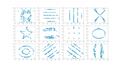
The twelve datasets that make up the datasaurus dozen. For each set of data (to two decimal places):
the mean of the \(x\)-values is 54.26; the mean of the \(y\)-values is 47.83;
the standard deviation of the \(x\)-values is 16.76; the standard deviation of the \(y\)-values is 26.93;
the correlation coefficient between \(x\) and \(y\) is -0.06.
Creating datasets like this is not trivial: if you have a set of values for the statistical properties of a dataset, it is difficult to create a dataset with those properties—especially
one that looks like a certain shape or pattern.
But if you already have one dataset with the desired properties, you can make other datasets with the same properties by very slightly moving every point in a random direction then
checking that the properties are the same—if you do this a few times, you'll eventually get a second dataset with the right properties.
The datasets in the datasaurus dozen were generated using this method: repeatedly adjusting all the points ever so slightly, checking if the properties were the same, then
keeping the updated data if it's closer to a target shape.
The databet
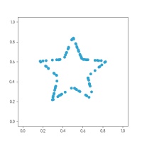
Using the same method, I generated the databet: a collection of datasets that look like the letters of the alphabet. I started with this set
of 100 points resembling a star:
After a long time repeatedly moving points by a very small amount, my computer eventually generated these 26 datasets, all of which have the same means,
standard deviations, and correlation coefficient:
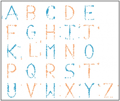
The databet. For each set of data (to two decimal places):
the mean of the \(x\)-values is 0.50; the mean of the \(y\)-values is 0.52;
the standard deviation of the \(x\)-values is 0.17; the standard deviation of the \(y\)-values is 0.18;
the correlation coefficient between \(x\) and \(y\) is 0.16.
Words
Now that we have the alphabet, we can write words using the databet. You can enter a word or phrase here to do this:
Given two data sets with the same number of points, we can make a new larger dataset by including all the points in both the smaller sets.
It is possible to write the mean and standard deviation of the larger dataset in terms of the means and standard deviations of the smaller sets: in each case,
the statistic of the larger set depends only on the statistics of the smaller sets and not on the actual data.
Applying this to the databet, we see that the datasets that spell words of a fixed length will all have the same mean and standard deviation.
(The same is not true, sadly, for the correlation coefficient.) For example, the datasets shown in the following plot both have the same means and standard deviations:
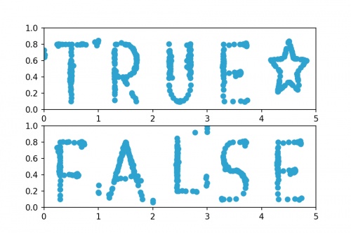
Datasets that spell "TRUE☆" and "FALSE". For both sets of (to two decimal places):
the mean of the \(x\)-values is 2.50; the mean of the \(y\)-values is 0.52;
the standard deviation of the \(x\)-values is 1.42; the standard deviation of the \(y\)-values is 0.18.
Hopefully by now you agree with me that Anscombe was right: it's very important to plot data as well as looking at the summary statistics.
If you want to play with the databet yourself, all the letters are available on GitHub in JSON format.
The GitHub repo also includes fonts that you can download and install so you can use Databet Sans in
your next important document.
References
[1] Graphs in statistical analysis by Francis J Anscombe. American Statistician, 1973.
[2] Same stats, different graphs: generating datasets with varied appearance and identical statistics through simulated annealing by Justin Matejka and George Fitzmaurice. Proceedings of the 2017 CHI Conference on Human Factors in Computing Systems, 2017.
(Click on one of these icons to react to this blog post)
You might also enjoy...
Comments
Comments in green were written by me. Comments in blue were not written by me.
⭐ top comment (2023-02-03) ⭐
Very cool! Thanks for sharing ????Jessica
Add a Comment
2017-02-25
Recently, I've noticed a few great examples of misleading uses of numbers in news articles.
On 15 Feb, BBC News published a breaking news article with the headline
"UK unemployment falls by 7,000 to 1.6m".
This fall of 7,000 sounds big; but when compared to the total of 1.6m, it
is insignificant. The change could more accurately be described as a fall from 1.6m to 1.6m.
But there is a greater problem with this figure. In the
original Office of National Statistics (ONS) report,
the fall of 7,000 was accompanied by a 95% confidence interval of ±80,000.
When calculating figures about large populations (such as unemployment levels), it is impossible to ask every person in the UK whether they
are employed or not. Instead, data is gathered from a sample and this is used to estimate the total number. The 95% confidence interval
gives an idea of the accuracy of this estimation: 95% of the time, the true number will lie of the confidence interval. Therefore, we can
think of the 95% confidence interval as being a range in which the figure lies (although this is not true, it is a helpful way to think
about it).
Compared to the size of its confidence interval (±80,000), the fall of 7,000 is almost indistinguishable from zero. This means that it
cannot be said with any confidence whether the unemployment level rose or fell. This is demonstrated in the following diagram.
To be fair to the BBC, the headline of the article changed to "UK wage growth outpaces inflation"
once the article was upgraded from breaking news to a complete article, and a mention of the lack of confidence in the change was added.
On 23 Feb, I noticed another BBC News with misleading figures: Net migration to UK falls by 49,000.
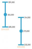
This 49,000 is the difference between
322,000 (net migration for the year ending 2015) and
273,000 (net migration for the year ending 2016).
However both these figures are estimates: in the original ONS report,
they were placed in 95% confidence intervals of ±37,000 and ±41,000 respectively. As can be seen in the diagram below,
there is a significant portion where these intervals overlap, so it cannot be said with any confidence whether or not net immigration actually fell.
Perhaps the blame for this questionable figure lies with the ONS, as it appeared prominently in their report while the discussion of its
accuracy was fairly well hidden. Although I can't shift all blame from the journalists: they should really be investigating the quality of these
figures, however well advertised their accuracy is.
Both articles criticised here appeared on BBC News. This is not due to the BBC being especially bad with figures, but simply due to the
fact that I spend more time reading news on the BBC than in other places, so noticed these figures there. I quick Google search reveals that the unemployment figure was
also reported, with little to no discussion of accuracy, by
The Guardian,
the Financial Times, and
Sky News.
(Click on one of these icons to react to this blog post)
You might also enjoy...
Comments
Comments in green were written by me. Comments in blue were not written by me.
I've seen archaeologists claiming proof that event A happened before event B because the radiocarbon date of A was 50 years before B. Except the standard error on both dates was 100 years. They even showed the error bars in their own graphics, but seemed to not understand what it meant.
My favorite species of ignoring the measurement error is the metric conversion taken to way too many decimal places. The hike was 50 miles (80.467 kilometers) long.
My favorite species of ignoring the measurement error is the metric conversion taken to way too many decimal places. The hike was 50 miles (80.467 kilometers) long.
Perry Ramsey
Add a Comment

